There are those who insist the day of the infographic has ended. This may be true for fad-following designers who produce cool images with graphs, charts, legends and zero information content but infographics isn’t like a typeface or style of layout.
Infographics as a discipline uses the way we’re wired as humans to help us better understand the world and the issues that face us. A good infographic can convey as much information as a well-reasoned argument and in half the time.
Of all the senses the eye has the greatest bandwidth. We are able to take in more information through the retina than the other four senses combined.
Until such time as we are able to stream information directly into the brain the infographic is going to be with us.
London Jewelers, Ingle and Rhode, long known for their stand against questionable practices in the diamond trade have produced the Infographic below.
Image provided by Ingle and Rhode
It shows the signatories to the Kimberley Agreement and draws attention to the fact that while the Kimberley Agreement guarantees your engagement ring won’t feature stones from areas of the world where diamonds are being used to fund rebel armies it does not consider the activities of brutal oppressive regimes which use diamond wealth to tyrannise their own populace in the same light.
Zimbabwe is the most recent signatory. The image has been widely circulated.
Getting your message shared by others means that the whole world can be your marketing department. Staples pulled this off recently with an infographic that’s fun, competitive and a little alarming for those of us who think we’re as smart today as we were in college. Try embedding it in your FB feed and see how many friends pick up on it.
eReader Test by Staples
It links directly back to the product, in this case e-readers and makes the user aware of just how much he or she could get from one. But the real gem is the social media sharing component. The user is so involved and it’s natural to click and share on Twitter and Facebook.
Good infographic design can also help us master notions of scale. What’s a billion for example? And a hundred billion? There’s a brilliant talk on data visualisation by David Mcandless which shows, among other things, that US military spending is reasonable, that a crowd is more intelligent than you’d think and that the recent recession is more scary than you’d ever dream possible. You’ll find it here: David McCandless – The Beauty of Data Visualization
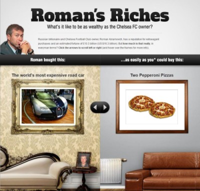
Just how rich is Roman Abramovitch, owner of the world’s largest private yacht, a 767 and Chelsea Football Club? If the zeros make your brain fizz there’s an infographic here that helps put things in perspective. It shows, for example, that when Roman buys himself a Bugatti Veyron the financial equivalent for you or I is a couple of pepperoni pizzas. A perfect example of how design can also master notions of scale.
Image provided by Jackpot Party
Information design, the compression of knowledge and the language of the eye are all part of infographics. The communications industry is always looking for the Next Big Thing and for a while infographics became part of a bandwagon.
For those who say its day is gone I’d say this. If you have nothing to say, say nothing.
[box]Written by James Daugherty
James is a marketer and blogger who is obsessed with surfing the world wide web, caffeine, and snowboarding. When he’s not blogging about marketing he’s tweeting – @jimmydaugherty[/box]


I’m by nature a visual person so with that in mind I do like the ‘idea’ of infographics. The problem I see time and again is poor design – if an infographic looks good but the text is too small to read it’s worse than worthless, it’s annoying to the reader.
Hi James,
I am also a visual person and I really like pictures and video to understand and learn. As a result of this infographics. are just perfect for me and I understand why they are so valuable online. Thank you very much for sharing . take care Rosemary
Enjoyed your article James. I believe infographics are a great visual for quick information. Because of that, I think they will continue to do well. With video, social media boards and even your blogs – they make a great addition to information you are sharing with your audience. Which in my book means better experience for visitors, customers and clients.
I love infographics. But then again, i always had my walls covered with posters when i was a kid. 🙂
But truthfully, there are some I have seen that drive home a point in such a way as to make it instantly understandable. Conveying ideas that would have taken hours to write and pages of text. But there are some others, that after I have studied them, i still have no idea what they are supposed to be about.
But that doesn’t mean I don’t like infographics, I love them, just that some are a bit better and more easily understandable than others. And those I love.
I was just commenting to a client yesterday about the popularity of infographics! She is in a really tough niche and is going to create a few to assist her in getting her point across.
I too love them, being very visual it really helps me to understand more quickly and easily. Like you I had posters all over the walls too. 🙂
Thanks everyone. Inforgraphics are great when done well, just like the Staples eReader App – it has a great social element that gives people the urge to share.